Case Study
Contemporary Woods


Contemporary Woods is a distinguished custom furniture maker that specializes in creating high-quality, unique pieces for both residential and commercial spaces. With a focus on exceptional craftsmanship and personalized designs, they have a reputation for delivering beautiful, functional, and enduring furniture.
Challenge
Contemporary Woods was in search of a fresh new logo that would elevate their brand and convey their dedication to quality craftsmanship. Their existing logo was outdated and didn’t capture the essence of their bespoke furniture designs. They needed a logo that would stand out and resonate with their discerning clientele.
Solution
Our team brainstormed multiple design concepts, each reflecting the brand’s commitment to excellence, innovation, and craftsmanship. We presented these initial concepts to Contemporary Woods, guiding them in design strategy on which one would resonate with their customers and their vision.
Process
Based on our research and the client’s preferences, we started sketching various logo concepts. We explored different ideas related to wood carving, such as chisels, wood shavings, and textures. However, it looked too boring and predictable. We wanted a non-standard but at the same time, very balanced, timeless, and simple logo.
After brainstorming, we decided to try a new direction and look at woodworking as an art. We realized that this would help us reflect the name of the company, “Contemporary Woods”, make it unusual for this industry and thus memorable and stand out in the market.


Like any natural material, wood obeys the rules of balance and harmony. One of them is the Fibonacci theory. We were inspired by the shapes of wood shavings, which are often shaped like a perfect “golden” spiral: and developed this initial version.


When we hear “wood texture” we imagine rings coming from the center and growing in size. The size of these rings also obeys the golden Fibonacci rule. However, these rings are not perfect in shape, and we wanted to turn this into art while still retaining the texture of the wood. This was the second option (and yes, the one the client chose at the end!) we presented.


In addition to perfect spirals, thin wood shavings can take on various intricate shapes. We looked at different forms and created the CW monogram, which looks like swirling wood shaving. These 2 logos have more craft spirit but remain modern and have great scope for logo variability.


In designing this concept, we wanted to demonstrate the striped texture in wood shavings.Together with the bold and modern use of the uncaps font, we created a very contrasting and dense logo.
Result
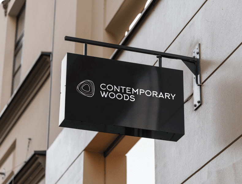
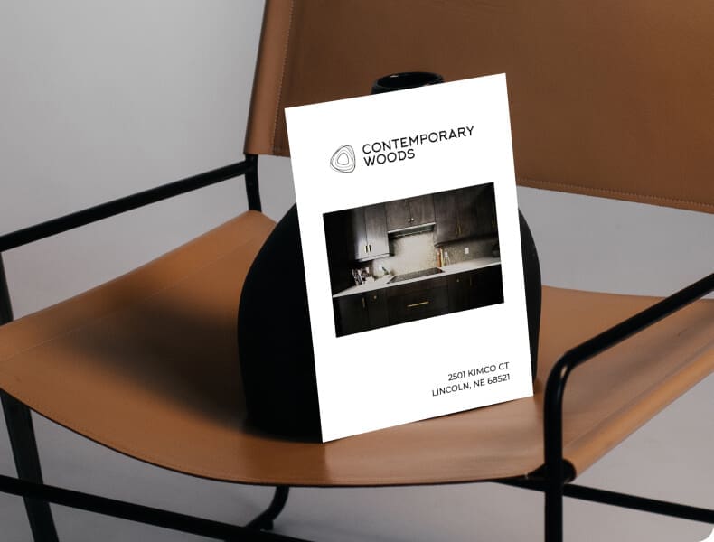
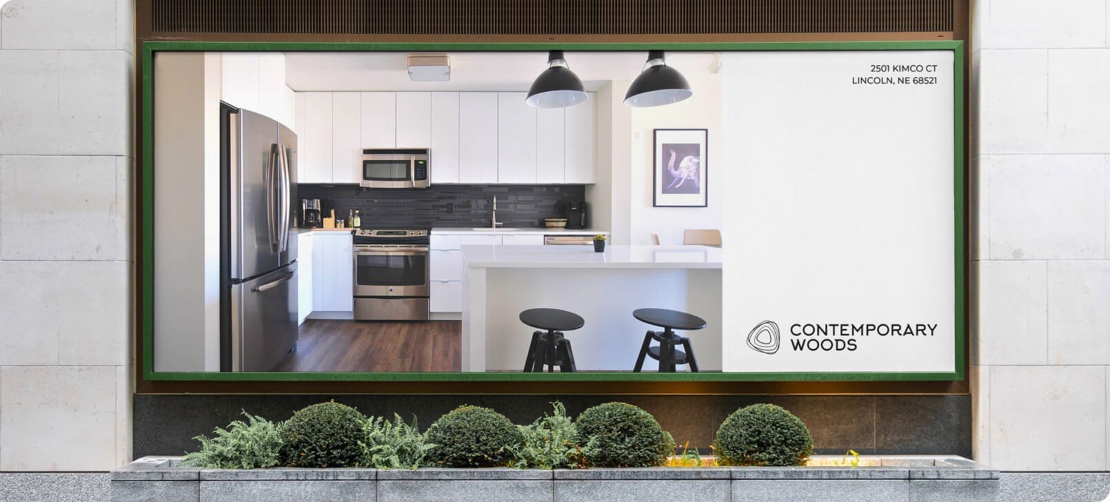
The second logo was chosen as the direction. In the process of creative discovery, we saw this option as the most striking, timeless logo for Contemporary Woods that encapsulated their dedication to quality and craftsmanship. The new logo not only elevated their brand image but also created a strong visual identity that resonates with their target audience.
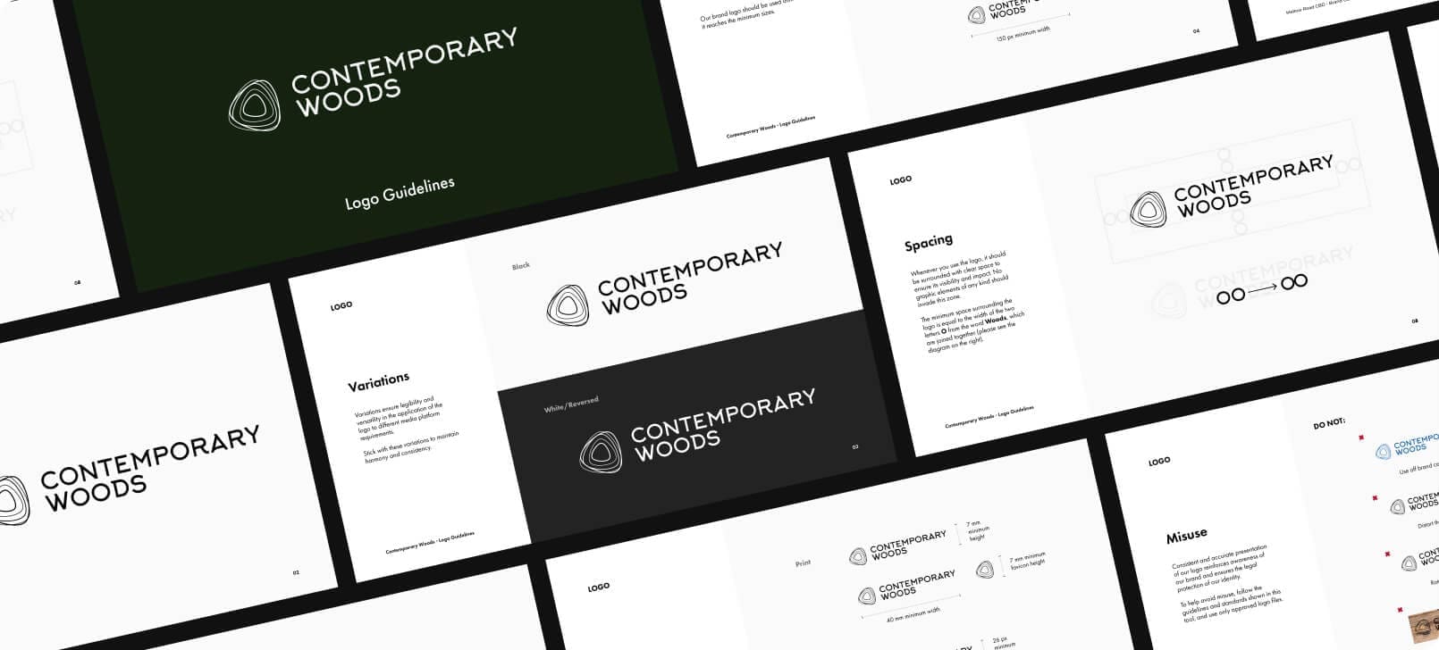
With this refreshed logo, Contemporary Woods now has a solid foundation for their brand, paving the way for future marketing endeavors and solidifying their position as a leading custom furniture maker.












Impact
While a new logo wasn’t the sole reason for Adam’s business nearly doubling since its launch, it played a crucial role in creating a strong first impression on his target audience – contractors looking for a reputable and experienced brand to work with. The enhanced brand awareness and positive feedback from the market served as a testament to the logo’s success in reflecting Contemporary Woods’ commitment to quality and craftsmanship. By leveraging the logo’s visual appeal, Adam was able to captivate contractors and foster a sense of trust and credibility, contributing to the remarkable growth of his business.


