Case Study
LoneStar Urgent Care
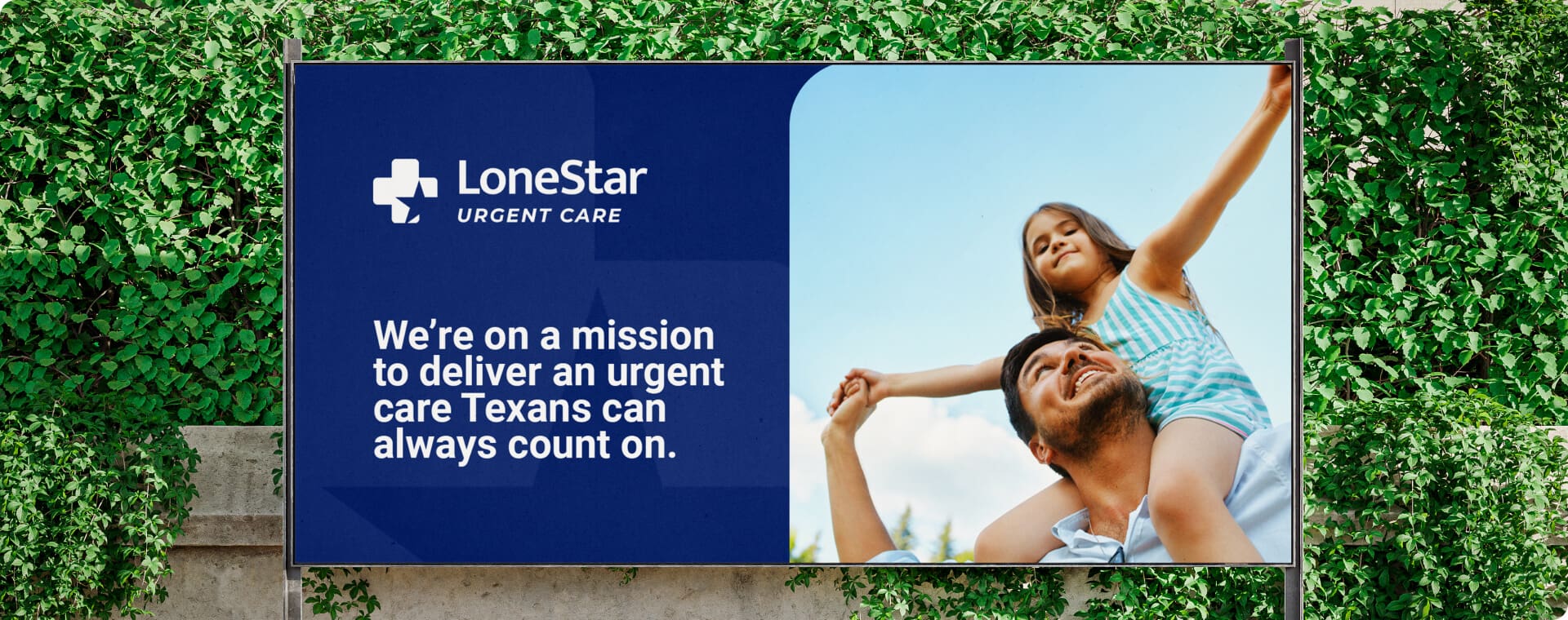


Jace Cain and Elias Hinojosa came to Oh Hello at the beginning of their journey. The two healthcare professionals were starting LoneStar Urgent Care, a Texas-based urgent care center. Jace and Elias didn't want LoneStar to be just another "in and out" urgent care experience. They had bigger plans for their business - they wanted to disrupt the healthcare industry in Texas with compassionate care that people could truly rely on.
Challenge
According to a survey by The Harris Poll, only 22% of adults trust urgent care facilities to provide high-quality care. This highlights the challenge that LoneStar Urgent Care faced in building trust with its target audience and establishing itself as a reliable and caring healthcare provider. We needed to develop refined messaging around compassionate care while highlighting the efficiency of the urgent care model. It was a delicate balance, but we were up for the challenge.
Solution
Our goal was to deliver a brand, and digital presence that truly embodied the core values of LoneStar Urgent Care: compassion and a patient-first experience. Through strategic differentiation from competitors and an authentic, human touch, we developed a memorable brand that resonates with LoneStar’s target audience.
Brand Messaging
At Oh Hello, we understand the importance of connecting with your audience on a personal and authentic level. To stand out in the crowded healthcare market, we knew we needed to focus on what truly sets them apart: their Texas compassion.
We developed messaging that combined the proud spirit of Texas with the caring nature of LoneStar Urgent Care, emphasizing that their doctors and staff were Texans too and that they shared the same values and sense of community as their patients.
It was key to highlight LoneStar Urgent Care’s key value propositions of short wait times, friendly faces, and compassionate care. By emphasizing these factors, we were able to clearly communicate the unique value of LoneStar Urgent Care’s experience, and what sets them apart from their competition.


Giving patients the Texas compassion they deserve. We value the patient as a person, not another number. Serving our community the LoneStar Way empowers us to deliver a patient-centered experience that leaves our patients feeling heard, cared for, and, most importantly, valued.
Logo Design
After developing the messaging, our task was to develop a logo that also communicated these same values. We started our work with various combinations of symbolic elements, such as the star, medical cross, and shield, to reflect the Texas pride in healthcare.
Our creative team has created about ten different variations of both the logo sign and font combinations. After iterating with our client through design strategy, we landed on a balanced logo, with a simple, minimalistic, catchy sign that reflects the company’s values. At the same time, this logo inspires confidence in the stability of the brand and services.


Brand Identity
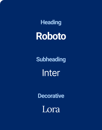
After creating the logo, we started building out the complete brand identity. This included the color palette, typography, photo palette, graphics and other elements that were unique to the brand.
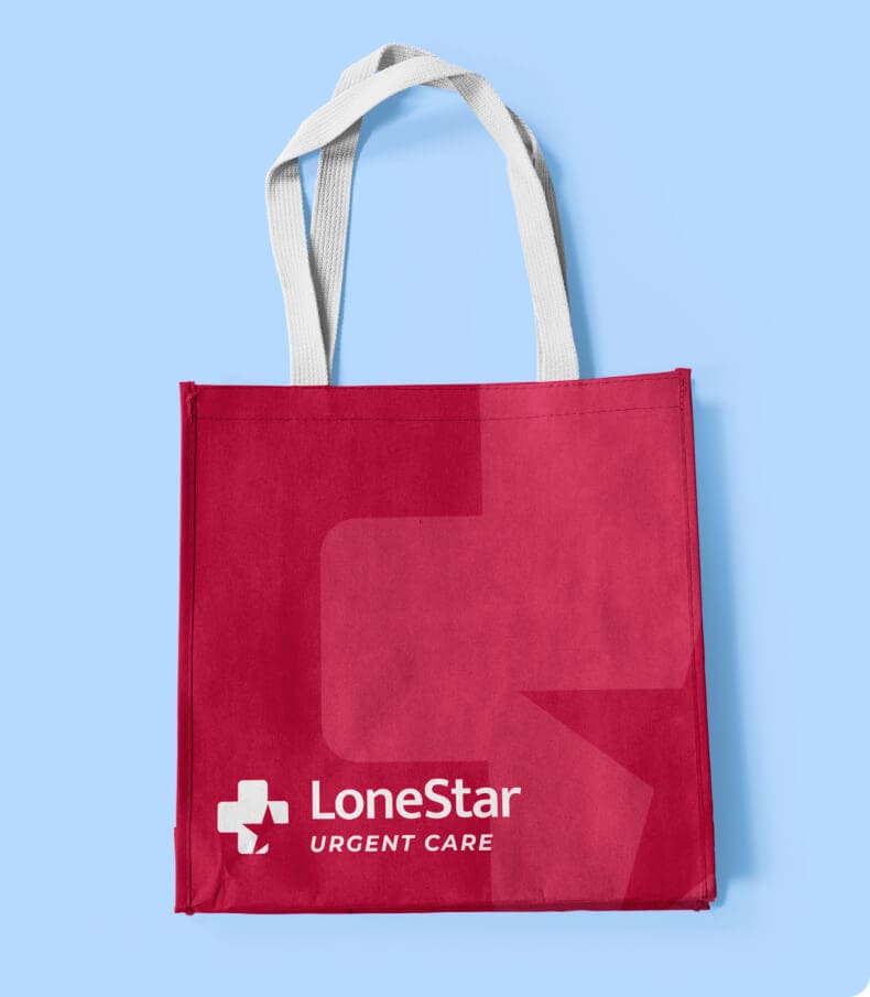
We also created designs for a wide variety of materials, including business cards, flyers and other collaterals, as well as social media designs. We incorporated our messaging into the collateral, and strategically selected images that communicated compassion and empathy.






Web Design
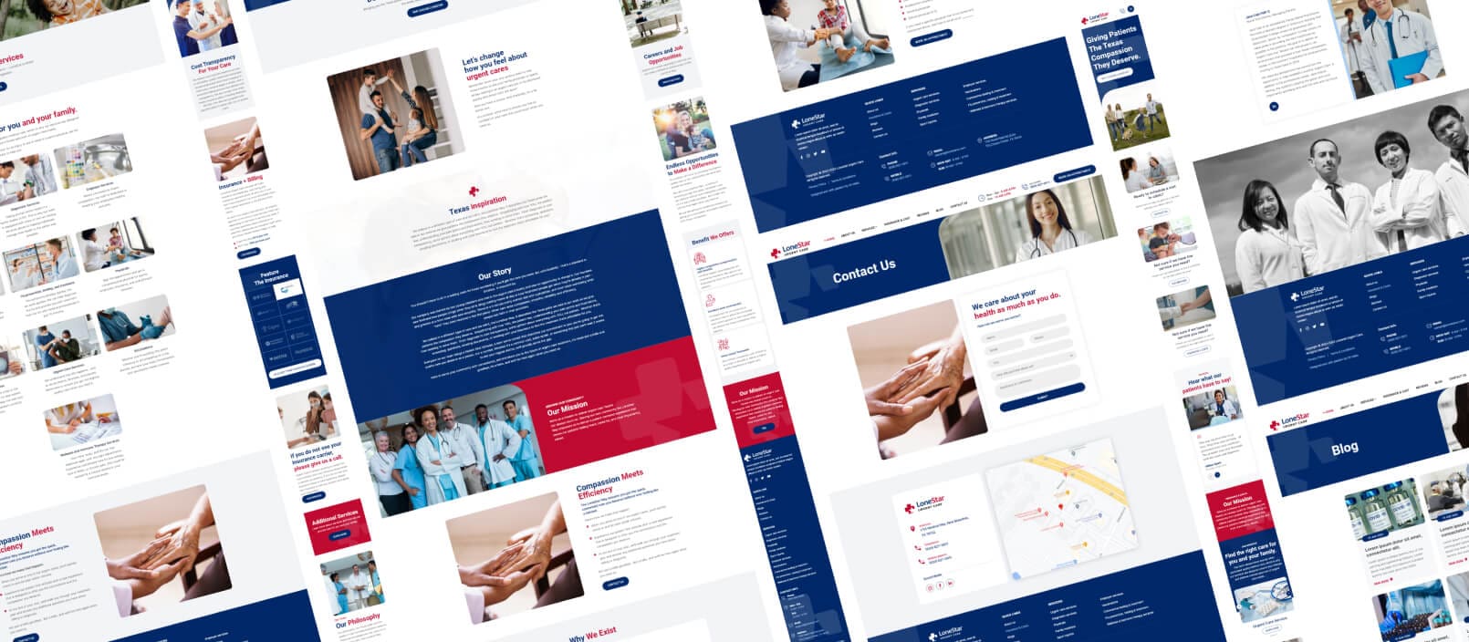
Leveraging our expertise in web design and development, Oh Hello crafted a visually captivating website that seamlessly reflects LoneStar Urgent Care’s unique identity and values. The site features an engaging user interface, with intuitive navigation, eye-catching visuals, and key brand messaging that effectively communicates the client’s commitment to compassionate care.
Step 01
Stylescape
We took the LoneStar team through our signature stylescape process, developing a stylescape that incorporated the new brand style to ensure consistency and brand recognition.


Step 02
Design
Using the approved stylescape and pre-designed sitemap, we were ready to dive into the design process.
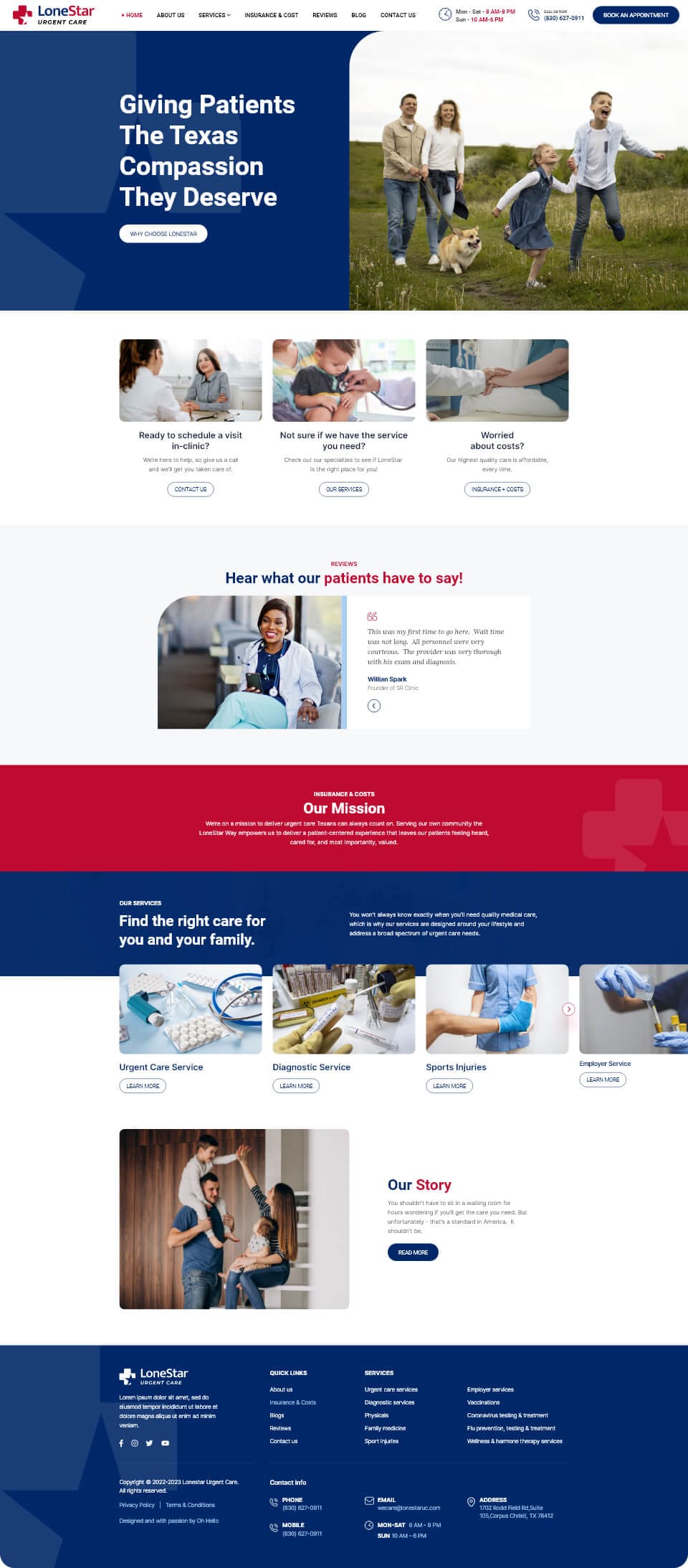


We made the navbar fixed to provide users with easy access to important information and the call-to-action button. For the hero screen, we used a combination of brand colors, rounded shapes, and a cross mark in the background, along with one of our developed key phrases.
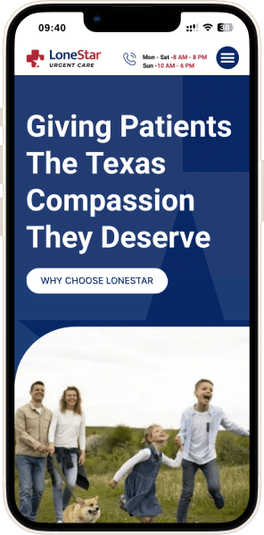


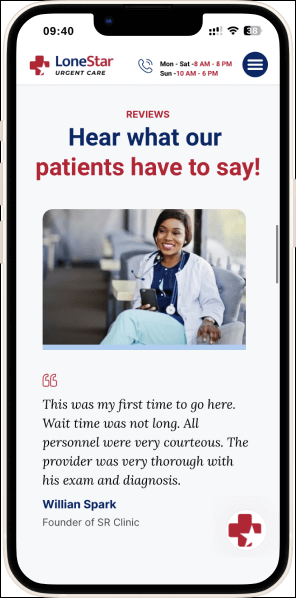


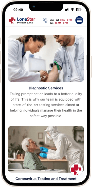
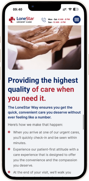
We made the navbar fixed to provide users with easy access to important information and the call-to-action button. For the hero screen, we used a combination of brand colors, rounded shapes, and a cross mark in the background, along with one of our developed key phrases.




Result
The improved website traffic, search engine ranking, bounce rate, and appointment bookings all contributed to the success of their first site. With their new brand delivered on time and on budget, LoneStar Urgent Care had a successful launch that has allowed them to break into their market and truly disrupt. They’re growing quickly with more patients excited that their local urgent care is offering truly, convenient and quality medical care.
Ultimately, our solution helped LoneStar drive patient experience and perception and that is evident from their reviews online: they received over 350 5-star reviews in less than 6 months from launch.


Impact
Our work has resulted in a significant impact on LoneStar Urgent Care’s success, allowing them to provide their patients with a higher quality of urgent care experience while simultaneously achieving their business goals. It’s a testament to the power of authentic messaging and the importance of highlighting the important factors of a brand: core values, patients, and the benefits of their services. LoneStar Urgent Care now plans to expand with additional locations throughout the state of Texas.


